Prahsys Brand Guidelines
.svg)
Prahsys Brand Guidelines
Typography
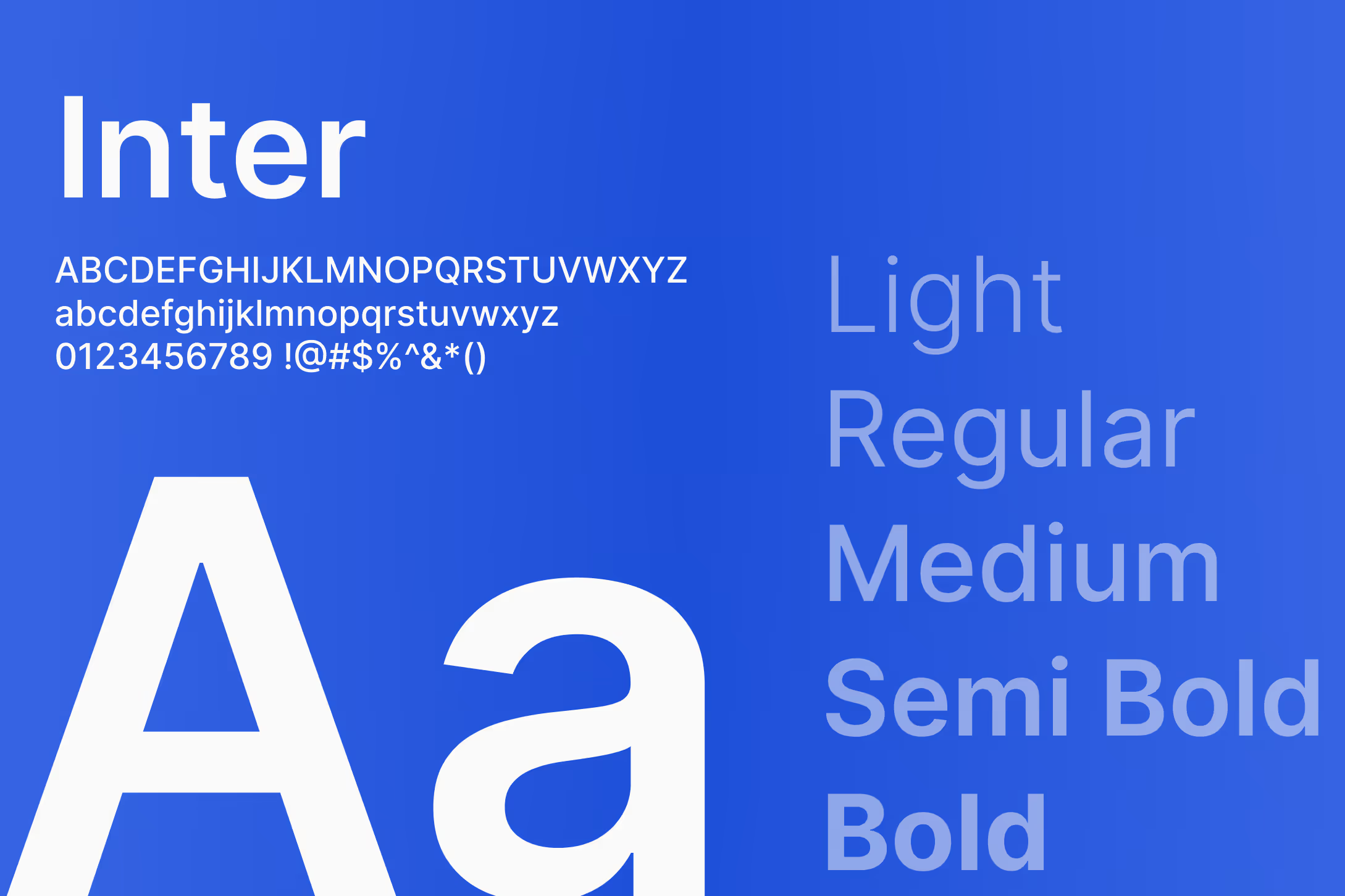
Our Typeface
Prahsys uses Inter across all digital products and brand materials. Inter was chosen because it is clean, highly legible at small sizes, and carries a modern, neutral quality that works equally well in a marketing context and a dense data interface. It doesn't call attention to itself, which is exactly the point. In healthcare technology, clarity and readability are never optional.
Inter is an open source typeface and is available for free at rsms.me/inter or via Google Fonts.
Fallback Typeface
In environments where Inter cannot be loaded, use the system sans-serif stack: -apple-system, BlinkMacSystemFont, Segoe UI, Roboto, Helvetica Neue, Arial, sans-serif. Never substitute a serif or decorative typeface.
Do's and Don'ts
Do use Inter for all Prahsys touchpoints, digital and print. Do rely on weight and size to create hierarchy rather than mixing typefaces. Do use the fallback stack in web environments where custom font loading is not guaranteed.
Do not use decorative, serif, or novelty typefaces anywhere in Prahsys materials. Do not stretch, condense, or apply artificial styling to the typeface.
Type Scale
Our type scale is built on Tailwind CSS sizing conventions and expressed in rem units. We use rem over pixels wherever possible, as rem values scale relative to the user's browser settings and produce more accessible, consistent results across devices and contexts. Each size in our scale is listed with its Tailwind class name, rem value, and line height. Use the toggle above to switch between rem and pixel values if you prefer to work in pixels. Use the breakpoint toggle to explore how the scale adjusts across desktop, tablet, and mobile.
Headings
Headings have fixed styles. Each heading level comes with a predefined Tailwind size class, rem-based font size, line height, and weight, and should be used as-is without modification. For example, our H1 at desktop is 7xl Semibold, which is 4.5rem with a 5.25rem line height. This consistency is what gives our layouts a reliable visual hierarchy across every product and touchpoint. H1 through H4 are available, and each scales down gracefully from desktop to tablet to mobile.
Use headings to establish structure and guide the reader through a page. Don't use heading styles purely for their size. If something isn't structurally a heading, use body text with an appropriate weight instead.
Body Text
Body text works differently from headings. Each size, ranging from Text Extra Small up to Text Extra Large, comes with a predefined font size and line height, but the weight is flexible depending on context. We use five weights across body text: Light, Normal, Medium, Semibold, and Bold. Normal is the default for most body copy. Semibold is the go-to for emphasis, supporting text under headings, labels, or anywhere you need to draw attention within a block of text without introducing a heading level. Light, Medium, and Bold are available for additional nuance when the context calls for it.
For example, a short descriptor beneath an H1 might use Text Large Semibold, while the paragraph that follows uses Text Base Normal. A data label in a table might use Text Small Semibold, while the value next to it uses Text Small Normal. The combination of size and weight is how we create nuance and hierarchy within body content.
Headings
H1 Heading
Tailwind
7xl
Weight
Semibold
Font Size
4.5rem
Line Height
5.25rem
Font Size
72px
Line Height
84px
H2 Heading
Tailwind
5xl
Weight
Medium
Font Size
3rem
Line Height
3.5rem
Font Size
48px
Line Height
56px
H3 Heading
Tailwind
3xl
Weight
Semibold
Font Size
1.875rem
Line Height
2.25rem
Font Size
30px
Line Height
36px
H4 Heading
Tailwind
xl
Weight
Semibold
Font Size
1.25rem
Line Height
1.75rem
Font Size
20px
Line Height
28px
Body Text
Extra Large
Tailwind
2xl Regular
Font Size
1.5rem
Line Height
2rem
Font Size
24px
Line Height
32px
Large
Tailwind
lg Regular
Font Size
1.125rem
Line Height
1.75rem
Font Size
18px
Line Height
28px
Regular
Tailwind
base Regular
Font Size
1rem
Line Height
1.5rem
Font Size
16px
Line Height
24px
Small
Tailwind
sm Regular
Font Size
.875rem
Line Height
1.25rem
Font Size
14px
Line Height
20px
Extra Small
Tailwind
xs Regular
Font Size
.75rem
Line Height
1rem
Font Size
12px
Line Height
16px
Headings
H1 Heading
Tailwind
6xl
Weight
Semibold
Font Size
3.75rem
Line Height
4.5rem
Font Size
60px
Line Height
72px
H2 Heading
Tailwind
4xl
Weight
Medium
Font Size
2.25rem
Line Height
2.5rem
Font Size
36px
Line Height
40px
H3 Heading
Tailwind
3xl
Weight
Semibold
Font Size
1.875rem
Line Height
2.25rem
Font Size
30px
Line Height
36px
H4 Heading
Tailwind
xl
Weight
Semibold
Font Size
1.25rem
Line Height
1.75rem
Font Size
20px
Line Height
28px
Body Text
Extra Large
Tailwind
2xl Regular
Font Size
1.5rem
Line Height
2rem
Font Size
24px
Line Height
32px
Large
Tailwind
lg Regular
Font Size
1.125rem
Line Height
1.75rem
Font Size
18px
Line Height
28px
Regular
Tailwind
base Regular
Font Size
1rem
Line Height
1.5rem
Font Size
16px
Line Height
24px
Small
Tailwind
sm Regular
Font Size
.875rem
Line Height
1.25rem
Font Size
14px
Line Height
20px
Extra Small
Tailwind
xs Regular
Font Size
.75rem
Line Height
1rem
Font Size
12px
Line Height
16px
Headings
H1 Heading
Tailwind
5xl
Weight
Semibold
Font Size
3rem
Line Height
3.5rem
Font Size
48px
Line Height
56px
H2 Heading
Tailwind
3xl
Weight
Medium
Font Size
1.875rem
Line Height
2.25rem
Font Size
30px
Line Height
36px
H3 Heading
Tailwind
2xl
Weight
Semibold
Font Size
1.5rem
Line Height
2rem
Font Size
24px
Line Height
32px
H4 Heading
Tailwind
xl
Weight
Semibold
Font Size
1.25rem
Line Height
1.75rem
Font Size
20px
Line Height
28px
Body Text
Extra Large
Tailwind
2xl Regular
Font Size
1.5rem
Line Height
2rem
Font Size
24px
Line Height
32px
Large
Tailwind
lg Regular
Font Size
1.125rem
Line Height
1.75rem
Font Size
18px
Line Height
28px
Regular
Tailwind
base Regular
Font Size
1rem
Line Height
1.5rem
Font Size
16px
Line Height
24px
Small
Tailwind
sm Regular
Font Size
.875rem
Line Height
1.25rem
Font Size
14px
Line Height
20px
Extra Small
Tailwind
xs Regular
Font Size
.75rem
Line Height
1rem
Font Size
12px
Line Height
16px
In Product UI
In our dashboard interfaces, full heading styles are rarely needed. Most of the hierarchy in a dense UI is built using body text sizes paired with the same five weights available in body text: Light, Normal, Medium, Semibold, and Bold. A page title might use Text Large Semibold, a section label might use Text Small Semibold, and supporting detail uses Text Small Normal. This keeps the interface clean and prevents heading styles from competing with the data itself.
Last Updated: July 8, 2026