Prahsys Brand Guidelines
.svg)
Prahsys Brand Guidelines
Icons
Our Icon Style
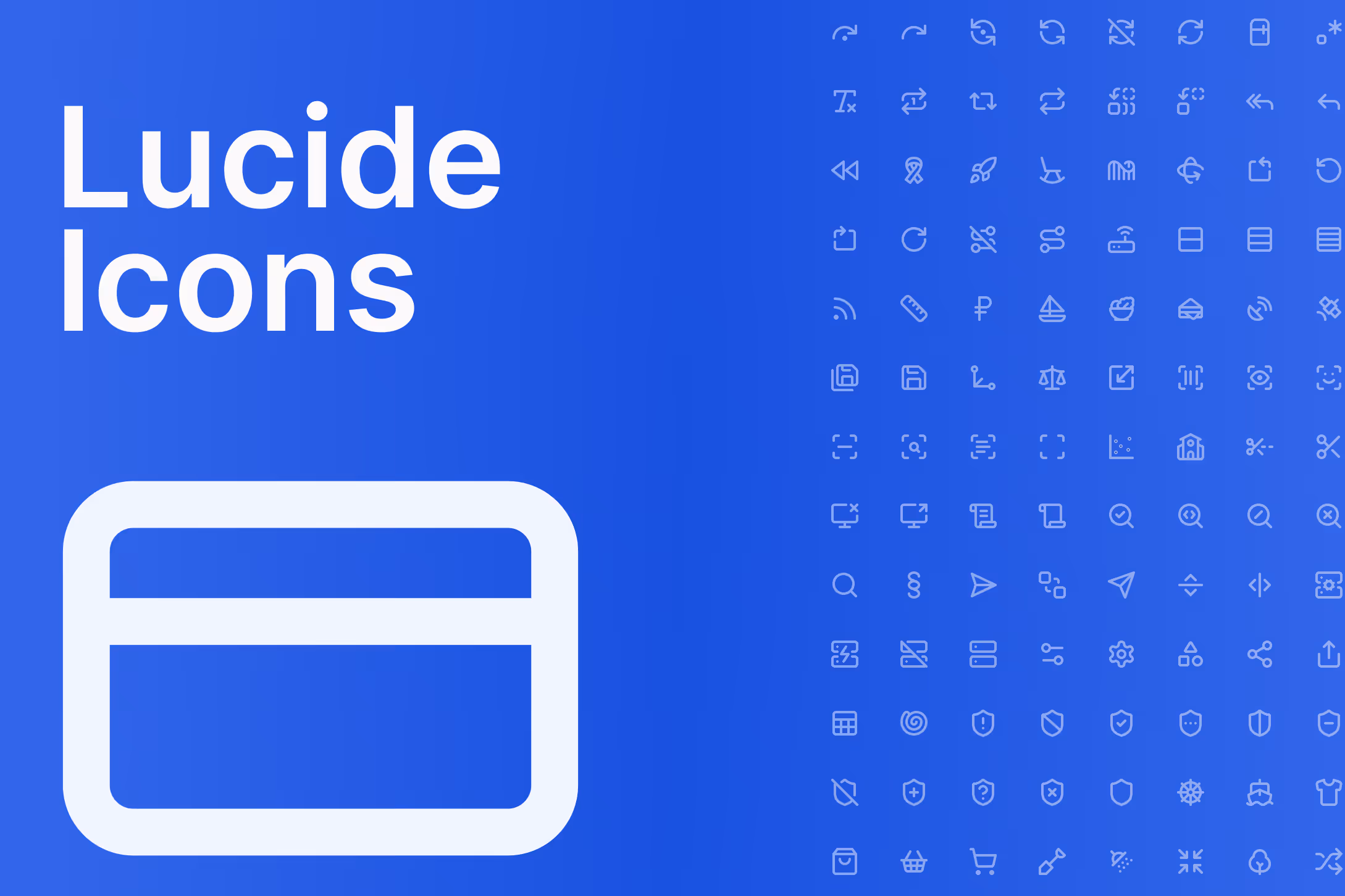
Prahsys uses Lucide as its icon library across all touchpoints, including dashboard interfaces, marketing materials, presentations, and documentation. Lucide was chosen for its clean, consistent stroke-based style that pairs naturally with Inter and our overall design language. The icons are open source, actively maintained, and available as React components, making them practical for both designers and developers.
Every Lucide icon is outlined and stroke-based by nature. This consistency is what makes them feel cohesive at scale, and it's why we don't supplement Lucide with icons from other libraries. When in doubt, find the closest Lucide equivalent rather than introducing an outside icon.
Sizing
Icons should always be used at one of our four recommended sizes: 16px, 20px, 24px, or 32px. These map loosely to context as follows — 16px works best for inline use alongside small text, labels, or table content. 20px suits body-level UI elements such as input fields, secondary actions, and supporting information. 24px is the standard for navigation items, primary actions, and most general UI use. 32px is reserved for feature callouts, empty states, or anywhere an icon needs to carry more visual weight on its own.
These are recommended defaults, not rigid rules. Use your judgment based on the surrounding context, but avoid arbitrary sizes that fall outside this scale.
Stroke Width
Stroke width should always be proportional to icon size. As a rule, stroke width is 1/12 of the icon's size. At 24px, use a 2px stroke. At 16px, use approximately 1.33px. At 20px, use approximately 1.67px. At 32px, use approximately 2.67px.
Lucide's default stroke width is 2px, which aligns with our 24px standard. If you are using icons at other sizes, adjust the stroke width accordingly to maintain visual consistency.
Color
Icon color should always feel intentional and never decorative. In product UI, icons should relate clearly to the surrounding content, using color tokens from our system to ensure consistency across light and dark modes. Avoid applying brand blue to every icon by default. Reserve color for icons that carry status, action, or meaning, and use neutral tones for supporting or structural icons.
In marketing and presentation contexts, icons should complement the layout without competing with headlines or primary visuals.
Icon Library
We use the full Lucide icon set. Rather than maintaining a separate catalog here, we link directly to the Lucide website where you can search, preview, and copy icons in your preferred format. When selecting an icon, always choose the option that most clearly communicates the intended meaning. Clarity always takes priority over visual interest.
Browse the full library at lucide.dev/icons
Do's and Don'ts
Do use Lucide icons exclusively across all Prahsys touchpoints. Do size icons from our recommended scale of 16, 20, 24, and 32px. Do adjust stroke width proportionally at 1/12 of the icon size. Do use color tokens rather than hardcoded values in product UI. Do choose icons based on clarity of meaning first.
Do not mix Lucide with icons from other libraries. Do not use arbitrary sizes outside the recommended scale. Do not apply decorative color to icons that serve a structural or neutral purpose. Do not stretch, rotate, or modify icon geometry. Do not use icons as a substitute for text when a label would communicate more clearly.
Last Updated: July 8, 2026