Prahsys Brand Guidelines
.svg)
Prahsys Brand Guidelines
Media & Social
This section covers how Prahsys shows up in social media contexts and provides official product mockup assets for use in presentations, marketing materials, and integrations. As our media presence grows, this section will expand to include additional guidance and downloadable assets.
Social Media
Prahsys social media posts follow a deliberately simple visual system. Every post is built from three elements: a branded color background, the Prahsys logo, and large, bold text. This consistency is intentional. It keeps our presence recognizable across platforms without requiring complex production for every post.
Always use the provided background images when creating a post. Never introduce colors that fall outside our brand system. The logo should always appear in the correct variation for the background it sits on, following the same rules outlined in the Logos section. Text should be large, direct, and easy to read at a glance. Think of each post as a headline, not a paragraph.
These guidelines apply whether you are creating content for Prahsys directly or co-promoting as a Channel Partner. If you are a Channel Partner creating content that references Prahsys, refer to the Co-Branding section for additional rules around logo usage and brand representation.
.avif)


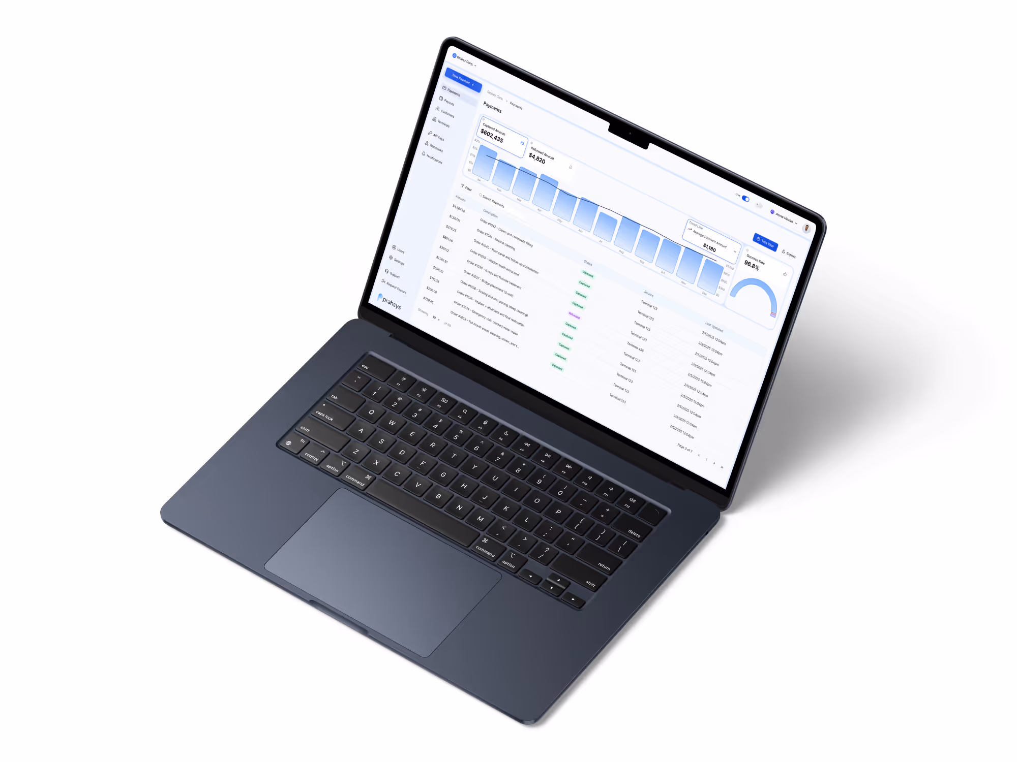
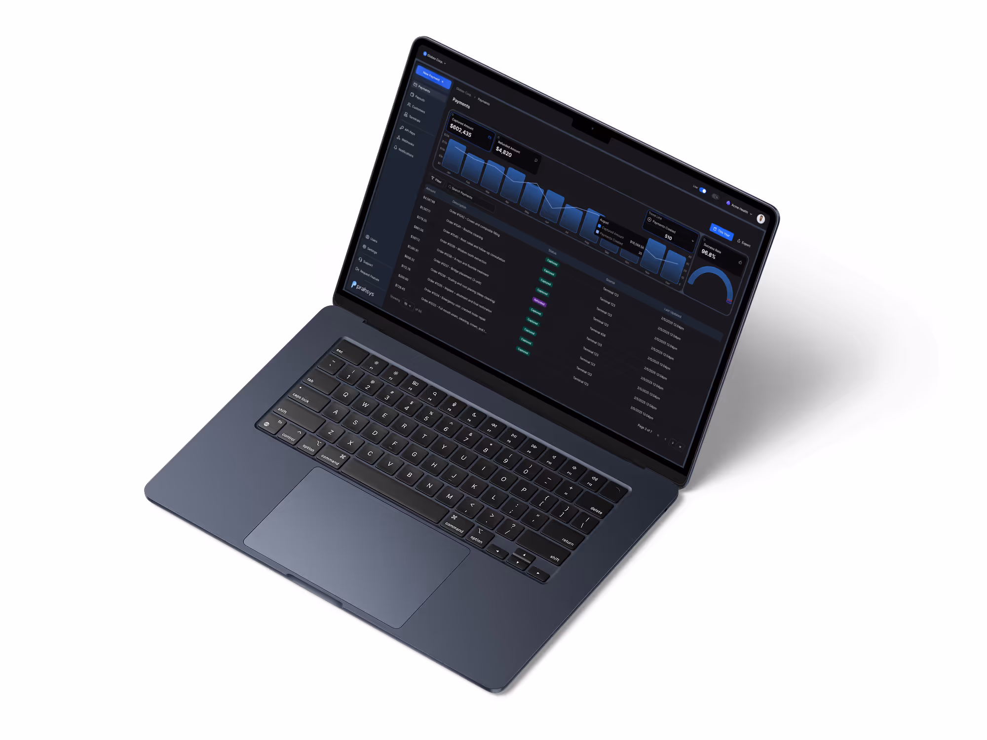
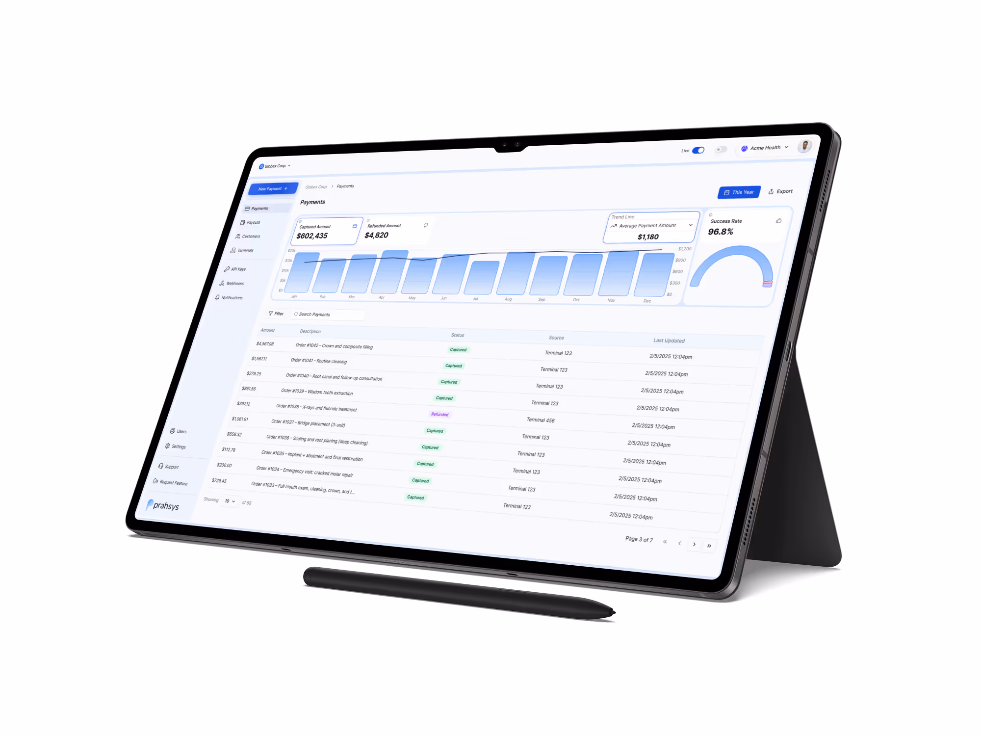
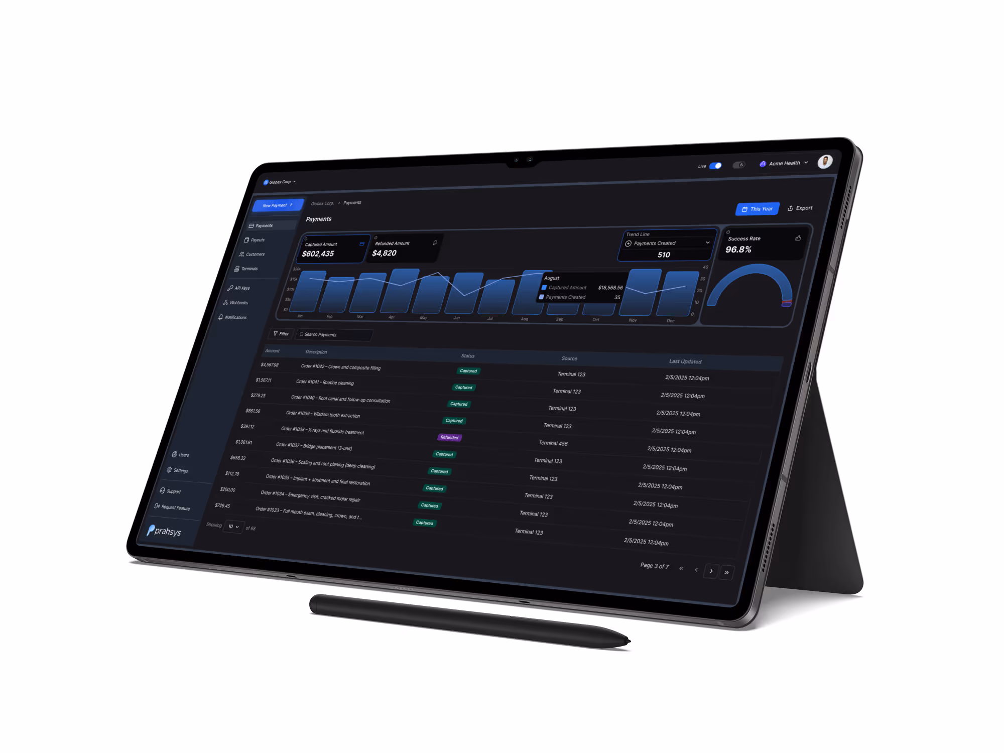
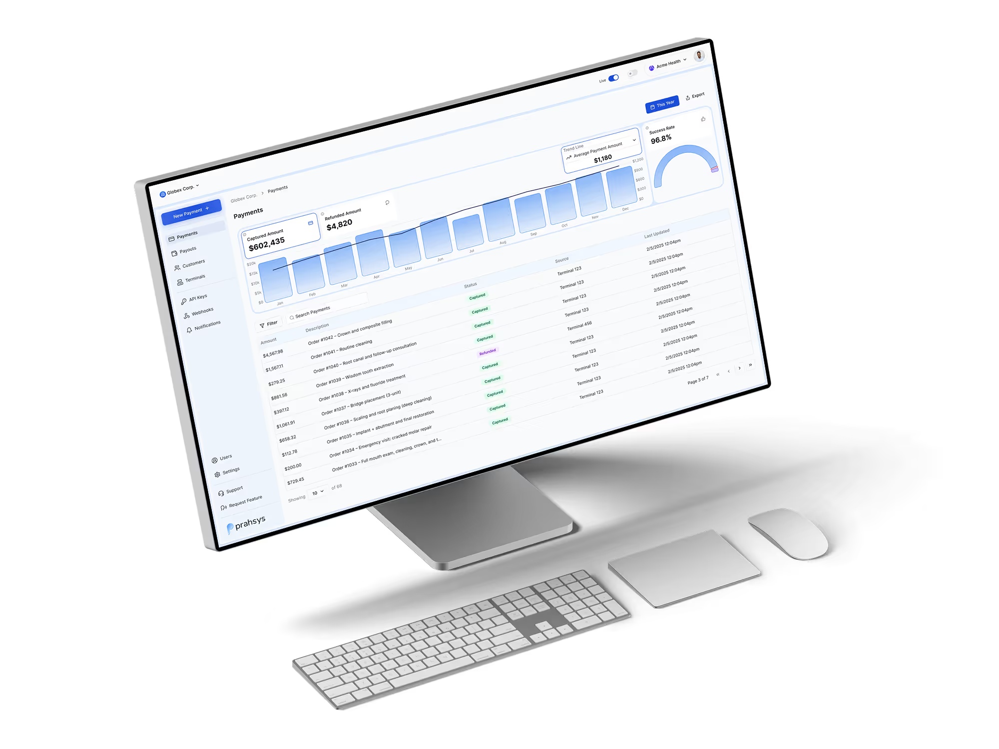
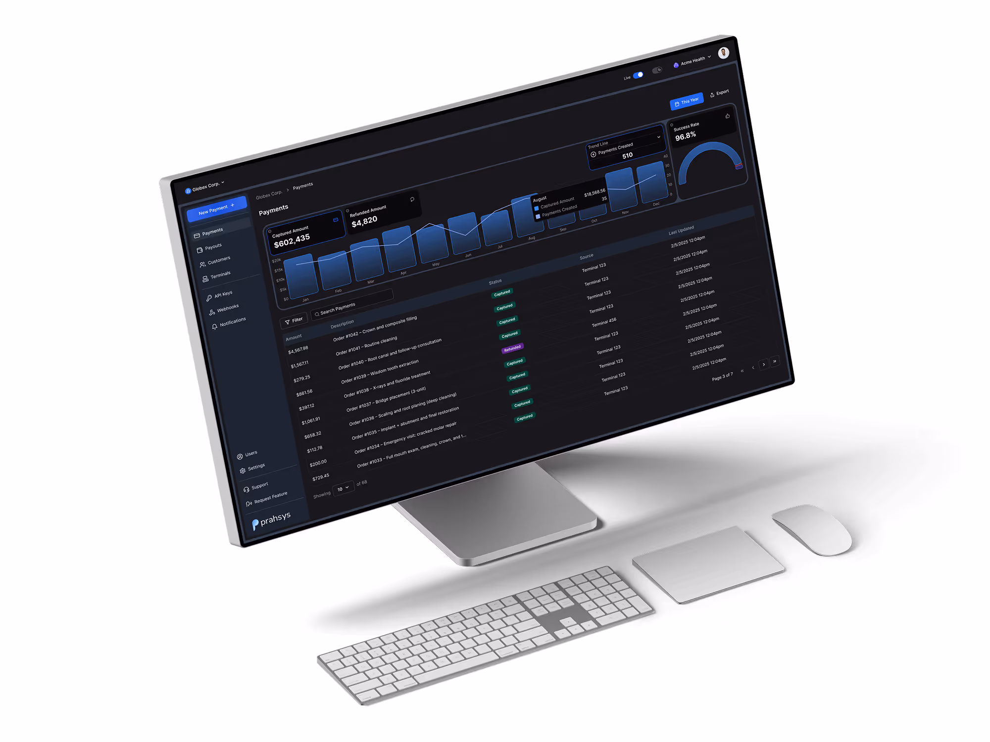
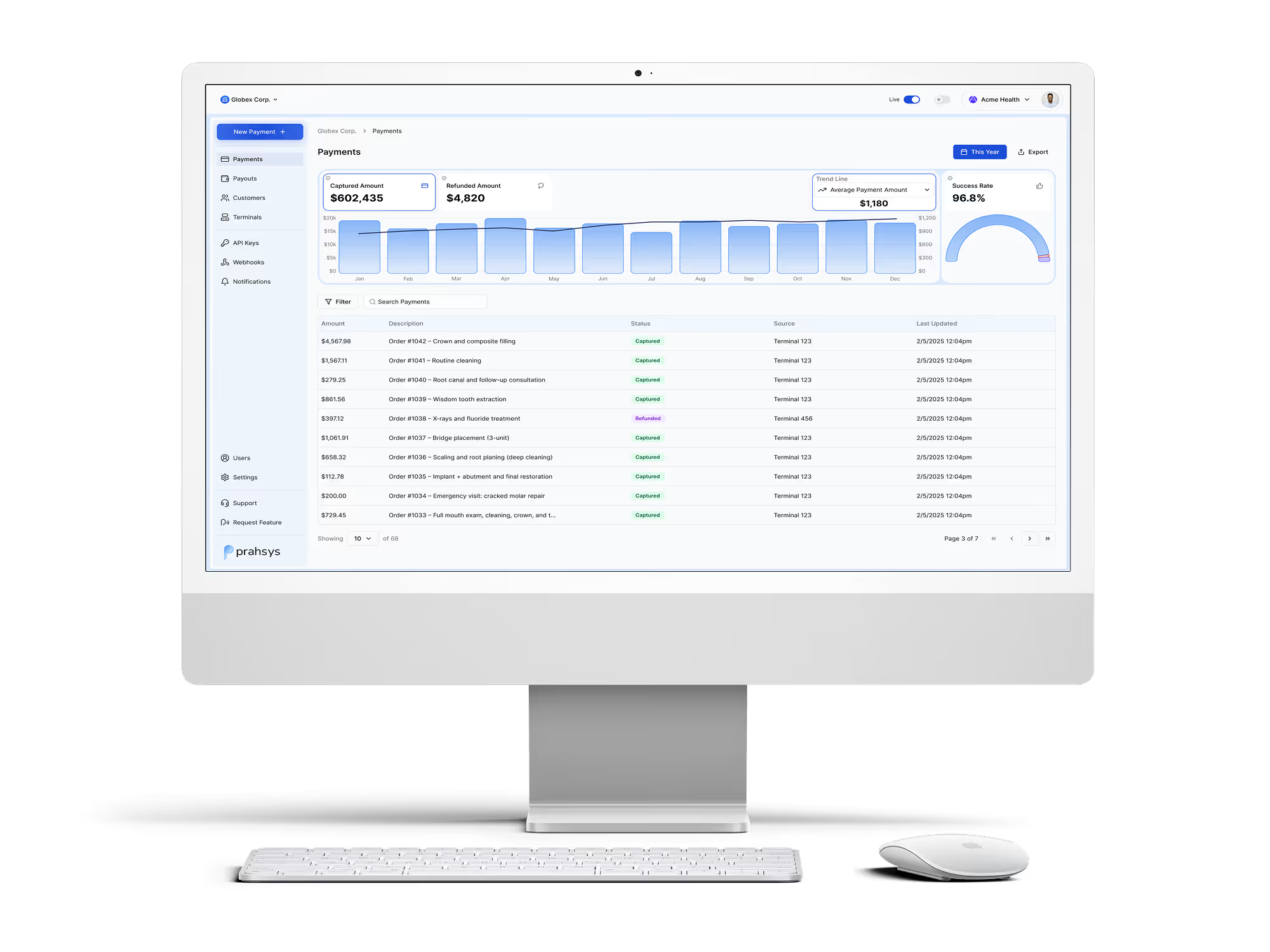
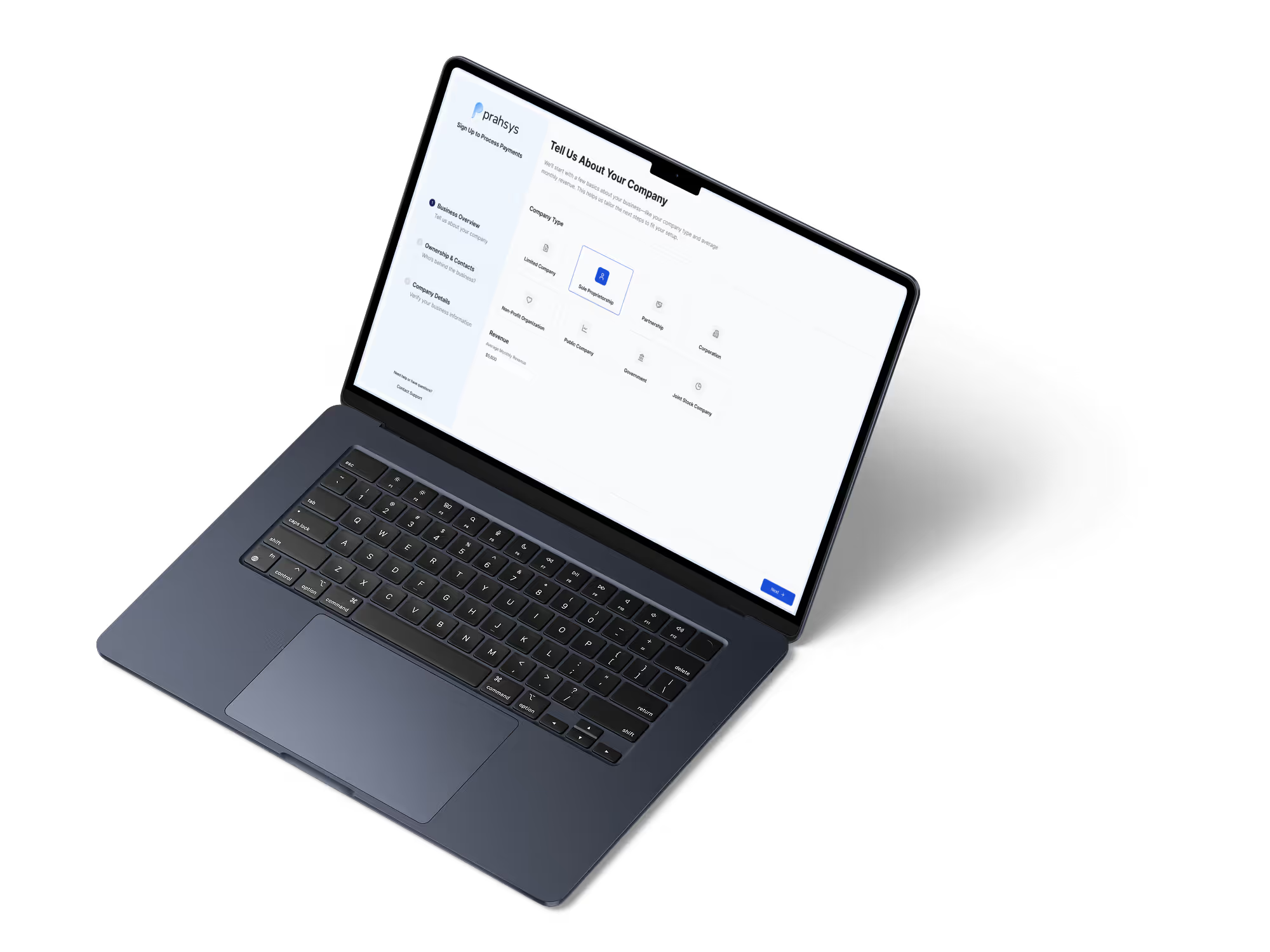
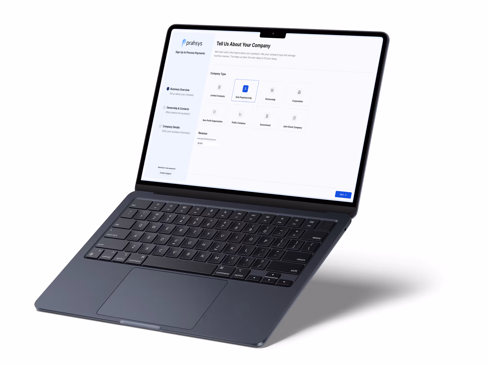
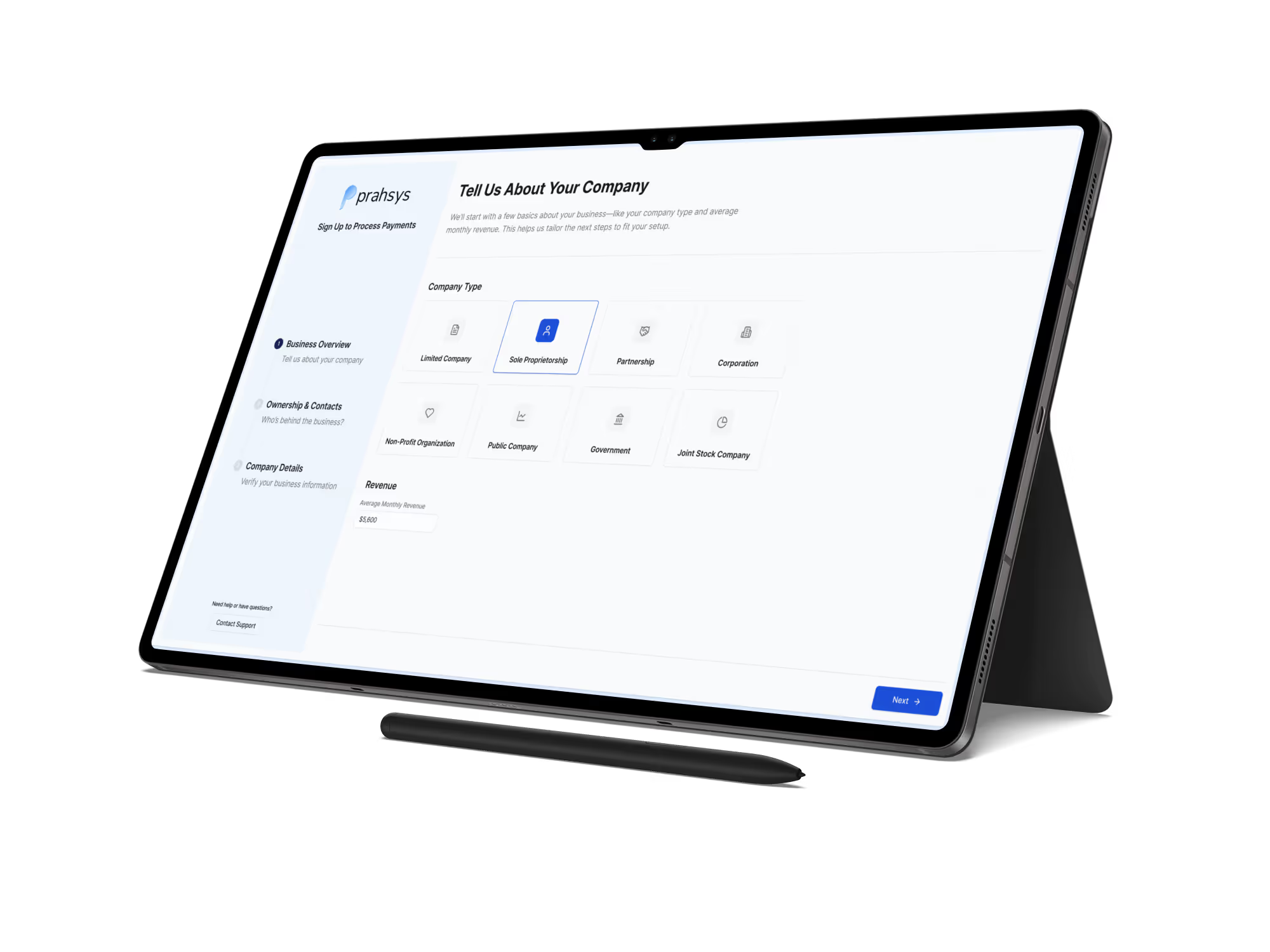
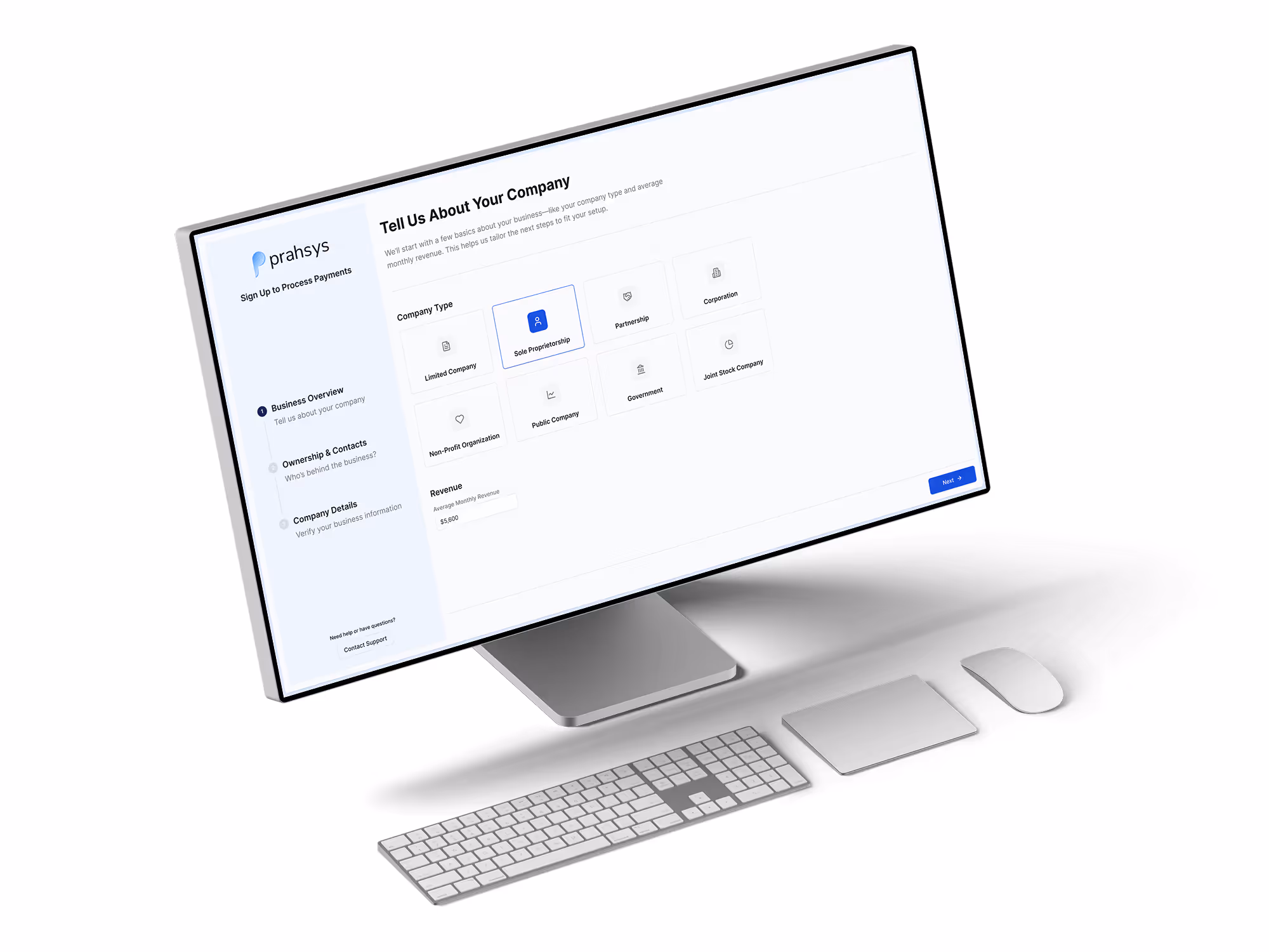
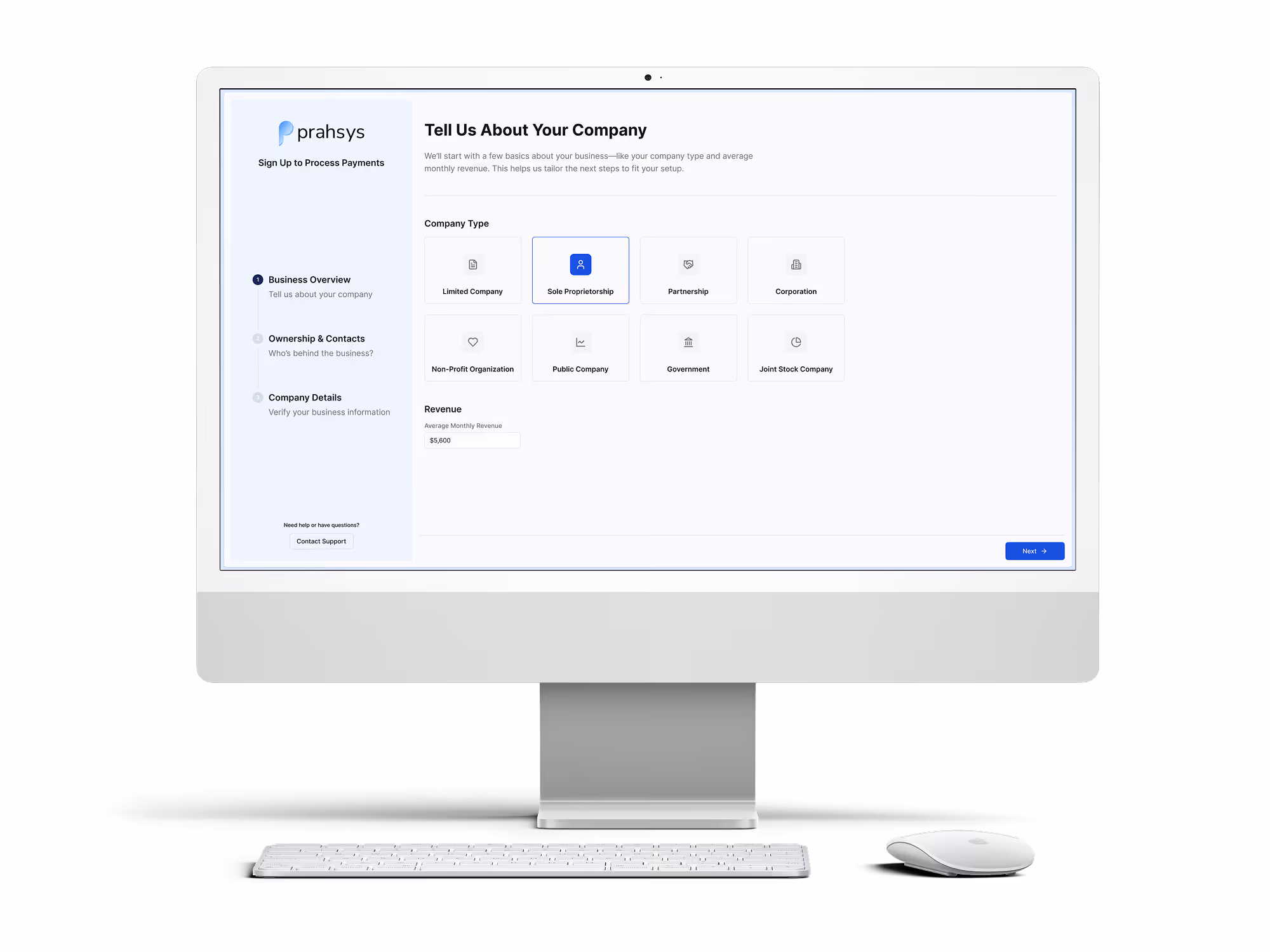
Product Mockups
Official Prahsys product mockup images are available to download below. These mockups show our product interfaces rendered on desktop, laptop, and mobile devices and are provided so that Channel Partners, developers, and marketing teams have a consistent, high-quality way to represent Prahsys in their own materials.
Always use the official mockups provided here rather than taking your own screenshots. This ensures that the product is represented accurately and that the visual quality stays consistent across every context it appears in. Do not crop, alter, or reframe the mockups in ways that misrepresent the product interface.
Mockups are available in PNG format and are provided at high resolution to support both digital and print use.

Last Updated: July 8, 2026